
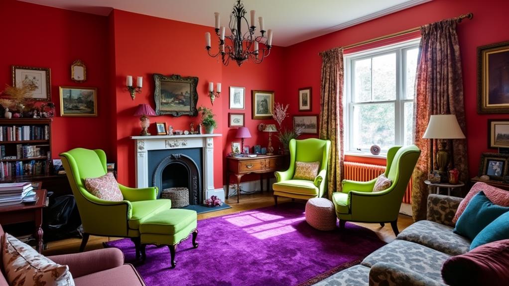
To avoid clash-inducing color mistakes, one must understand color harmony and relationships, which involve complementary and analogous colors to create unity or contrast. Balancing color intensity is essential; vibrant hues can overpower subtler ones, causing imbalance, while muted tones need bold accents for depth. Consider the impact of color psychology on mood, as misaligned choices can disrupt functional spaces. Lighting also alters color perception, with the direction and type of light influencing color's warmth and vibrancy. Common errors include excessive boldness and ignoring natural light's effects. For successful designs, explore how color strategies and tools can enhance your results.
Table of Contents
ToggleMastering Color Harmony
Understanding and mastering color harmony is frequently important for achieving a cohesive and aesthetically pleasing design. A fundamental aspect of this is comprehending color relationships, which are essential for creating unity and a welcoming atmosphere.
The color wheel, a significant tool in design, visually represents primary, secondary, and tertiary colors, helping designers select effective color combinations. These combinations include complementary colors, which are opposite on the wheel and create high contrast, and analogous colors, which sit next to each other, offering a more harmonious feel.
Monochromatic schemes focus on variations of a single color, providing subtlety and depth. Triadic colors, evenly spaced on the wheel, deliver vibrant yet balanced palettes. Neutral colors function as a backdrop, enhancing the overall design.
Balancing Color Intensity
Achieving the right balance of color intensity in design is essential for visual harmony and impact. Properly managing color intensity helps to maintain an equilibrium that is neither overwhelming nor underwhelming.
When vibrant colors dominate, they can overshadow subtler hues, disrupting the visual flow and creating a chaotic atmosphere. Conversely, muted colors, if not balanced with bold accents, may result in a lackluster and uninspired space.
Designers must be strategic in blending intense and subtle colors, ensuring that neither becomes overpowering. This involves utilizing color theory principles, such as complementary and analogous color schemes, to achieve cohesion.
Additionally, careful attention to saturation levels can prevent excessive brightness or dullness, fostering depth and vibrancy without compromising the design's overall aesthetic appeal.
Harnessing Color Psychology
A significant aspect of successful design is the strategic use of color psychology to influence mood and perception. Colors have the power to evoke emotional responses, making their selection essential in shaping a space's ambiance.
For example, blue is often associated with calmness and can promote tranquility in areas like bedrooms or offices. Conversely, yellow can stimulate energy and attention, making it suitable for spaces where creativity and communication are encouraged.
Understanding these psychological effects guarantees that colors are not only aesthetically pleasing but also functionally beneficial. Ignoring these impacts can lead to discordant environments; hence, integrating color psychology into design decisions enhances both the look and feel of a space, aligning it with its intended purpose and user experience.
Lighting's Role in Color
While color psychology plays a pivotal role in shaping mood and perception within a space, lighting profoundly influences how these colors are perceived. The interplay between color and lighting is essential, as different lighting types—natural or artificial—can greatly alter a room's ambiance and the way colors appear.
North-facing rooms, which receive cooler natural light, benefit from warmer tones to enhance coziness. Conversely, south-facing rooms, bathed in sunlight, can handle brighter hues, accentuating vibrancy.
The choice of light bulbs also impacts the overall aesthetic; warm white bulbs highlight reds and yellows, whereas cool white bulbs emphasize blues and greens. Understanding these dynamics guarantees that colors complement each other, contributing to a harmonious environment that aligns with the intended mood and function.
Avoiding Common Color Errors
Designers' frequent missteps with color can disrupt the balance and harmony of a space, leading to visual chaos. Common errors include the overuse of bold colors, which can dominate and overwhelm a room, making it feel chaotic rather than cohesive.
Similarly, neglecting to incorporate adequate contrast can result in a monotonous environment, lacking visual interest and depth. Ignoring the impact of natural light on color perception can also lead to unintended and often undesirable results, as colors change with lighting conditions.
Additionally, mixing clashing colors without understanding their relationships on the color wheel further contributes to a disorganized aesthetic. Maintaining a consistent color scheme is essential to achieving a harmonious design, ensuring that all elements work together seamlessly.
Practical Color Strategies
Addressing the challenges of common color mistakes, practical strategies are necessary to achieve a cohesive and intentional design.
Begin by selecting a color palette that aligns with the function and mood of the space, ensuring a harmonious blend of hues. Limit the palette to two to four primary colors to avoid overwhelming the design, and use neutral tones to balance more vibrant choices.
Prioritize color harmony by utilizing the color wheel, opting for complementary or analogous schemes that promote visual unity.
Consider the intensity and saturation of chosen colors, balancing bold shades with softer tones for a dynamic yet harmonious effect.
Test colors in varied lighting conditions to anticipate shifts in perception, ensuring the final design maintains its intended aesthetic appeal.
Tools for Color Success
Selecting the right tools for color success is essential in transforming design ideas into reality. A well-chosen palette guarantees that your design is cohesive and visually appealing.
Utilizing various tools can enhance your ability to create harmonious and balanced color schemes. Consider integrating the following into your design process:
- Color swatches: These provide tangible references for color matching and selection, aiding in achieving the desired aesthetic.
- Digital design apps: These offer a platform for experimenting with color combinations, enabling a preview of how colors interact before application.
- Pre-selected color palettes: These curated collections simplify the decision-making process, guaranteeing a complementary color scheme.
- Mood boards: These help visualize the overall design concept, incorporating textures and patterns alongside colors to evoke specific emotions.
Employing these tools facilitates informed color choices, fostering design success.